Hey there! I’m excited to share with you one of my favorite UX design projects from 2020 at RMIT. To be honest, it’s a case that makes me feel a little bit proud (okay, maybe a lot) because I absolutely loved working on it and my mentors loved it too!
Now, I’ve worked on website designs before, but this time I had the chance to dive into the world of app design, and let me tell you, it was an incredible experience. Not only did I learn a ton, but I was blown away by the results we achieved.
Without giving too much away, I can tell you that this project involved a lot of creativity and outside-the-box thinking. I wanted to make sure that my design was intuitive and user-friendly. I spent a lot of time doing research and testing, and the end result was something that I was really proud of.
Overall, I think this project was a standout for me because it challenged me in new ways and allowed me to flex my design muscles in a different context. I can’t wait to see what kind of design challenges I’ll get to tackle this 2023!
Role
UX/UI Designer
tools
Sketch, Invision & Adobe Creative Suite.
YEAR
2020
Description
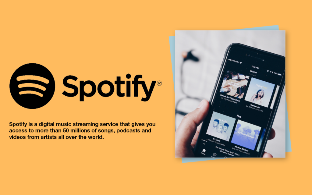
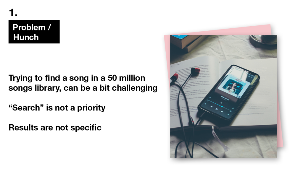
Spotify is an online platform for streaming digital music, podcasts, and videos featuring over 50 million tracks from artists worldwide. It can be somewhat difficult to locate a specific song that is not currently popular, recently released, or a timeless favorite.
Hunch
My hunch is that Spotify users may encounter difficulties while trying to locate particular songs, podcasts, or information. This may be due to the fact that when using the mobile application, individuals are likely multitasking, such as engaging in physical activities like running, exercising, cooking, driving, and so on.
Desk
Reseach
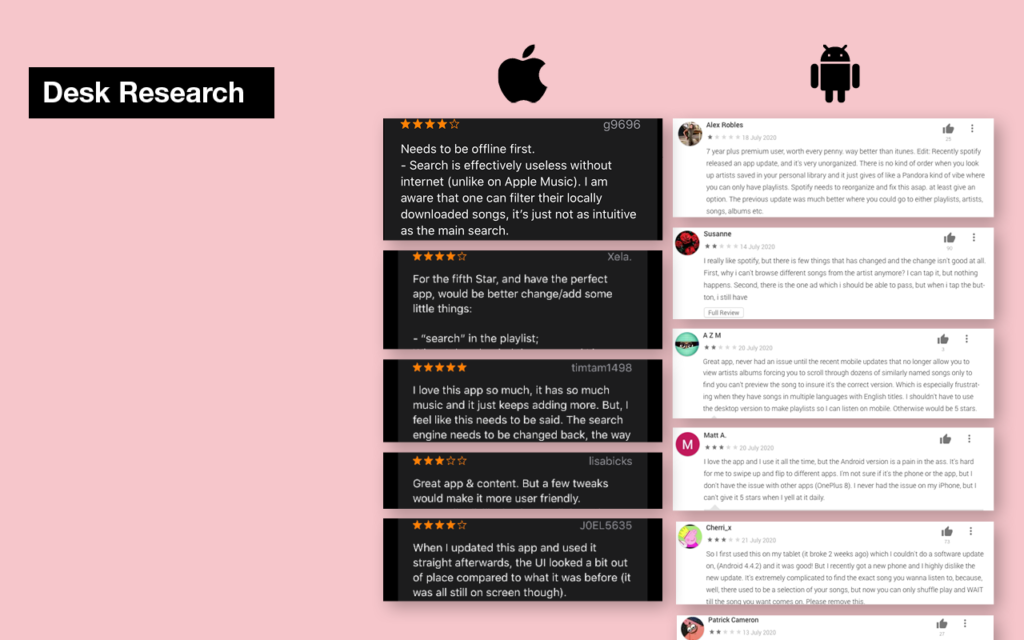
After conducting desk research comparing the Apple and Android Play Store, I observed that numerous individuals in the Apple Store discussed comparable issues. However, it seemed that most of them simply tolerated the situation. On the other hand, the situation was much more intense on the Play Store, with people expressing more frustration and even offering advice on UX and UI to Spotify developers.
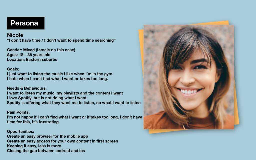
Persona
I have developed a persona that reflects the typical Spotify user, who is generally someone that listens to music while engaging in various simultaneous activities.
User
Research
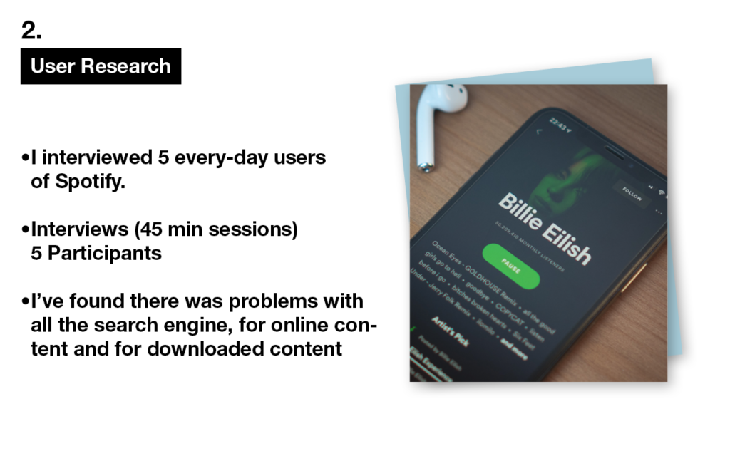
For the user research I conducted 5 one-on-one interviews.
Affinity
Mapping
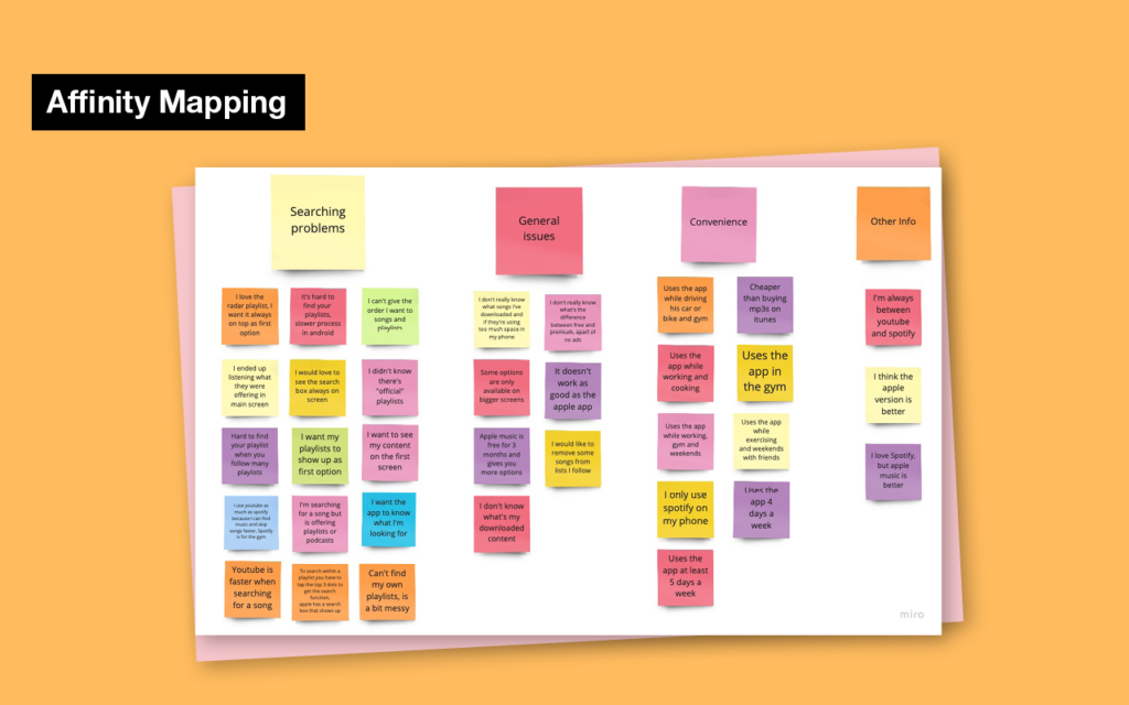
After gathering feedback from all the participants, I compiled their responses using affinity mapping. Upon analyzing the data, I identified certain patterns and insights, such as a clear indication of discomfort in the searching process. Additionally, some participants reported not using the search function at all, and instead, simply playing the recommended content displayed on the home screen of the app.
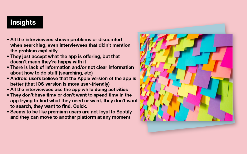
Insights
The content suffers from inadequate organization and a lack of information.
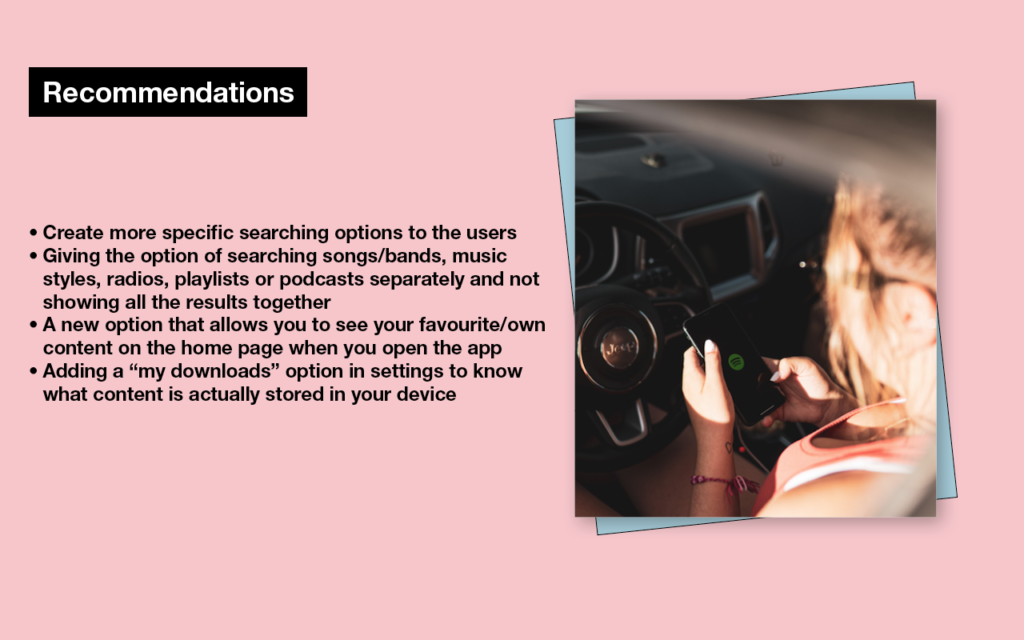
Recommendations
Based on this information, my suggestions are as follows:
Develop more specific search options, such as displaying only certain categories instead of showing everything together.
Provide convenient access to personal content on the home screen.
Establish a “My Downloads” folder, which is currently missing, to enable users to identify which songs or podcasts are available offline and stored on their devices.
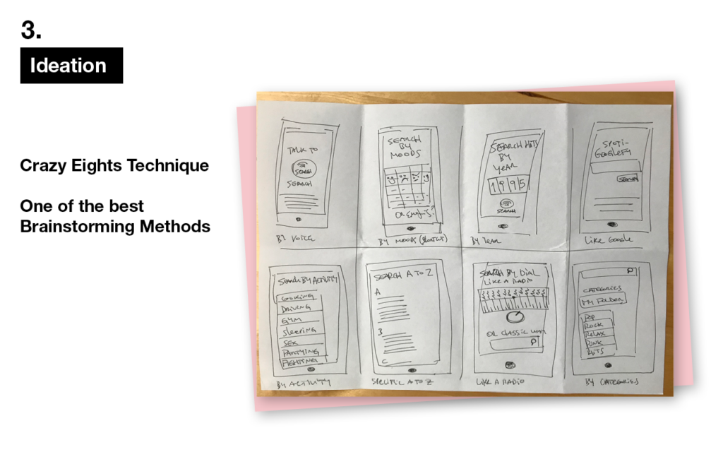
Ideation
For the ideation process I used the “Crazy 8” technique.
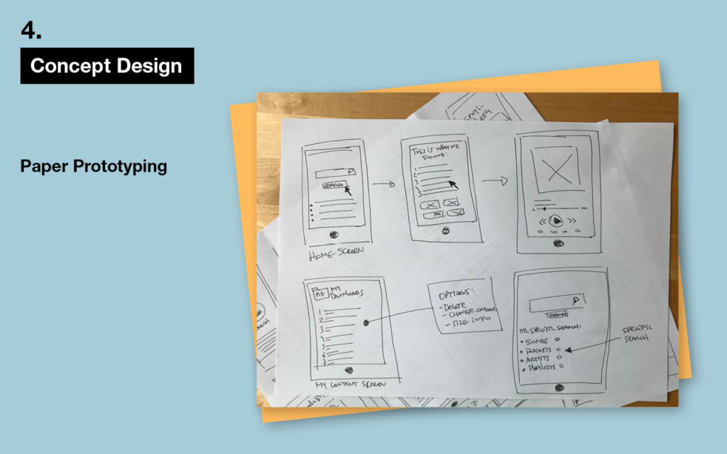
Concept
Design
Utilizing some of the concepts generated by Crazy8, I developed paper prototypes and conducted usability testing with participants, which proved to be highly beneficial.
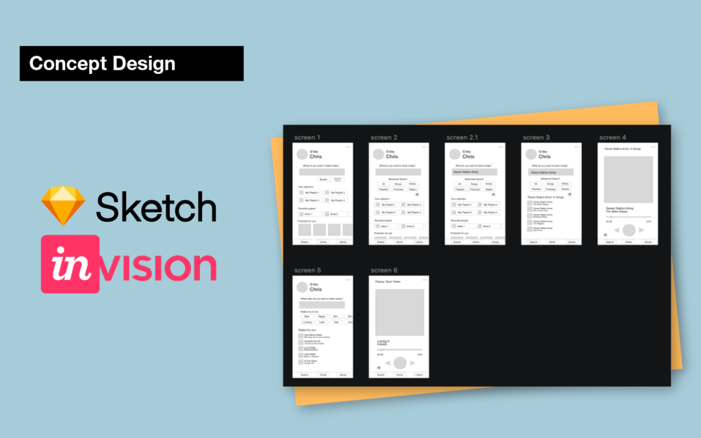
Concept
Design
With the participant’s feedback I created the low fi prototype and wireframes, using sketch and invision.
Usability Testing
And Iteration
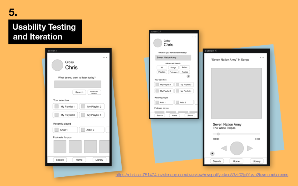
During step 5 of the process, I produced mid-fidelity wireframes that were interactive and ready for usability testing.
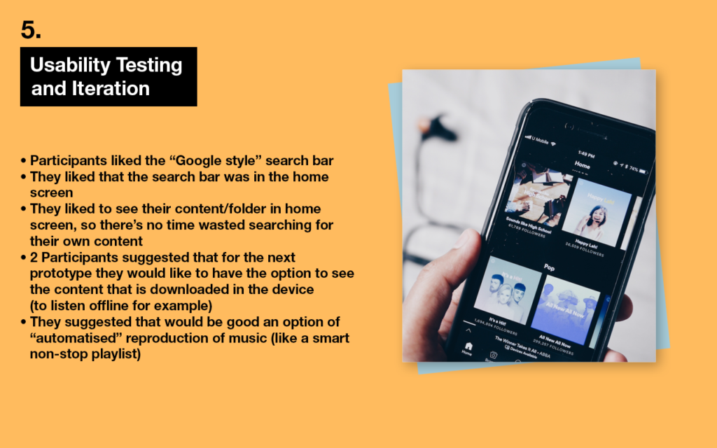
The design incorporated a “Google”-style search bar, which was familiar to all participants.
They appreciated that the search bar was located on the initial screen and that they could search for songs, playlists, and podcasts separately.
While the participants were pleased with the prototype, they expressed a desire for an option to view downloaded content.
Usability Testing
And Iteration
Additionally, they proposed an “automated” music playback feature, which could be useful in situations such as working out at the gym. This feature, for example, would enable music playback at a constant 125bpm without interruption or a set playlist. Unlike the current playlist functionality, which is simply programmed to play the songs on the list and then randomizes playback, this feature would offer a more tailored and seamless experience (Apple music is doing something similar).
While Spotify radio already exists, it is not always accurate in terms of music style and tempo.
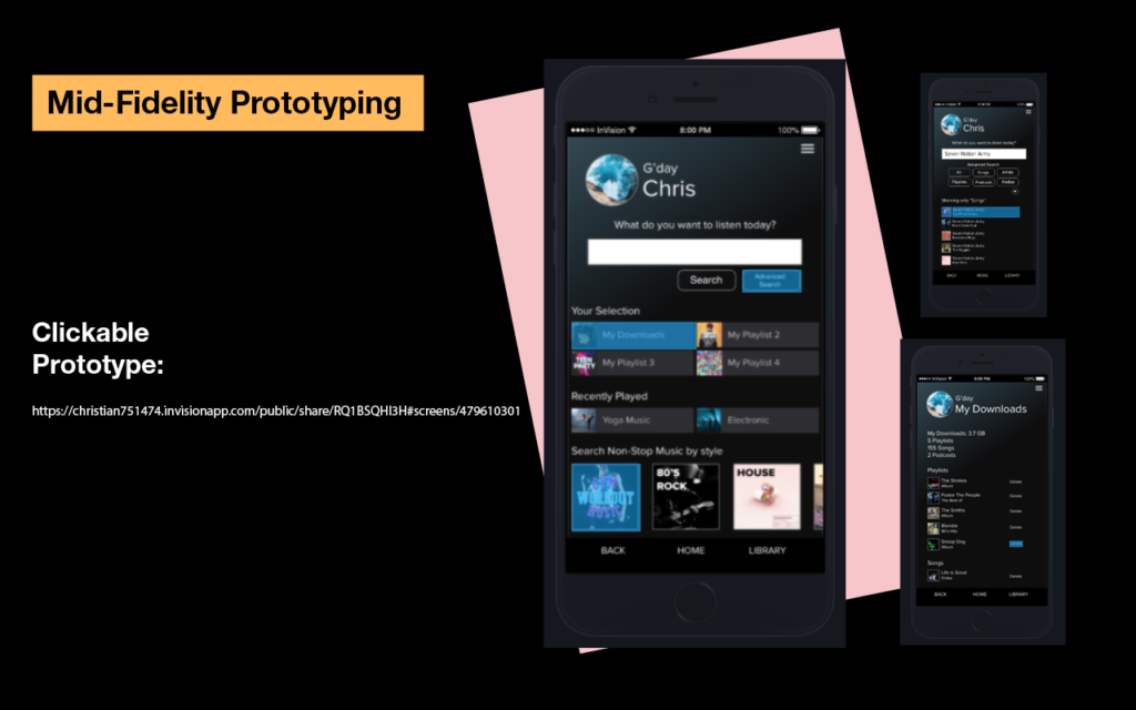
Prototyping And Final Result
As the project progressed, I designed a mid-fidelity prototype that featured the search bar, personal content, and downloads prominently displayed on the initial homepage.